Impressionist Movement
Thomas Moran - Forest Scene. 1898.
http://www.paintinghere.com/painting/Forest_Scene_6269.html
Thomas Moran often did landscape paintings using complimentary and analogous harmony systems. Above is an example of a complimentary harmony scheme, (yellow and green next to each other on the colour wheel) with the light source coming from the top left. Mixing opposites together you get greys and browns from which you can see in this painting in the shadows.
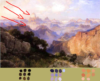
Thomas Moran. The Grand Canyon. 1902.
http://www.paintinghere.com/UploadPic/Thomas%20Moran/big/The%20Grand%20Canyon%201902.jpg
Another example of by Moran, only this time the analogous harmony system is being used. We know this with yellow/orange and purple/blue being opposite on the colour wheel but both colour groups compliment. Cooler colours push back while warm colours come forward, this is due to the fact that our eyes have red cones connected to the brain therefore we are more sensitive to the warms colours in light.
Claude Monet. La Gare Saint-Lazare. 1873-1878.
http://entertainment.howstuffworks.com/arts/artwork/claude-monet-paintings-1873-187814.html
Monet was always interested in light within his paintings. Like this this painting shows a busy trainstation people coming and going so this painting was done very quickly. He quickly captures the main elements of light and smoke but was also interested in the relation of colours. This is an example of complementary harmony. The shadows also reflect the colour of the sky; this is one important feature that level designers stress when creating 3d worlds.
Romantic Movement
Joseph Turner. The Passage of The Saint Gothard. date unknown.
http://www.bestpriceart.com/shop-online/images/vault/turner16.jpg
Turner known as 'the painter of light' using light as his key subject matter. One of the master's he admired was Claude for his quality in Italian landscape painting. This complementary colour scheme of yellow/orange and blue is often used in the Star Wars films especially out in the desert scenes. Again the cool blue is being pushed back while the cliff on the left stands thus drawing our eyes there before looking everywhere else.
Early Renaissance Movement (1400)
Artists before this period never really liked using red and greens as it creates a powerful contrast. But early Renaissance artist made use of these colours to create 'higher levels of beauty' by arranging colours in a different way.
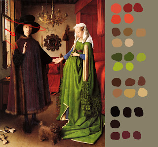
Jan Van Eyck. Portrait of Giovanni Arnolfini and his wife. 1434.
http://emfc.com/blog/wp-content/uploads/2011/01/jan-van-eyck-e28098portrait-of-giovanni-arnolfini-and-his-wife_-1434.jpg
Eyck was an early artist of 'physical accurate' painting. Naturalistic lighting is used in these kind of paintings, not artificial lights. In this painting there is good use of soft shadows at this time artists were learning 'Chiaroscuro' (the treatment of light and dark in paintings). With the contrast of red and green were are instantly drawn to the woman from which we then notice Giovanni and the dog at the bottom. Blue is used very subtly in this painting (the wives sleeves).
Andre Castagno. Last Supper. 1447.
http://upload.wikimedia.org/wikipedia/commons/b/be/Castagno,_Andrea_del_-_Last_Supper_-_1447.jpg
What you notice in Renaissance paintings is the same colours never touch each other and arranged in such a way that at first is overwhelming but pleasing at the same time. Painters at this time were experimented with the colours that were available to them, some colour pigments were expensive because some materials were only available from across the sea. One problem with looking at paintings as early as 1400 or even more is that paintings are often refurbished which means they are not in their original state.
High Renaissance Movement
Leonardo da Vinci. The Last Supper. 1495-1498.
http://johnkemeny.com/blog/wp-content/uploads/2006/06/rom37.jpg
Michael Angelo. Last Judgement. 1537-1541.
http://www.friendsofart.net/static/images/art1/michelangelo-buonarroti-last-judgment-1.jpg
Contemporary
Feng Zhu. Orange City. 2011.
http://fengzhudesign.blogspot.com/2011/07/orange-city.html
Today's concept artist such as Feng Zhu often use the Analagous Harmony colour system. This system is good for landscapes. Like the example above, we are instantly drawn to the city with its warms shades of orange, sky compliments the city by bringing it forward with the contrast of cool colours.


No comments:
Post a Comment