I have been to Mc Manus a number of times but never to look at how the items are actually being displayed. I took a lot of pictures and got some really good ideas for how I want to setup my place for the exposition. I have set up these kinda of workplaces before in college so I have a good idea how my work should be displayed in the best possible way.
Wednesday, 30 November 2011
Monday, 28 November 2011
3.0 - Architecture Studies
The 3d Environment I aim to create will be dominated primarily by a Gothic cathedral and it's important to understand what makes a building have that Gothic feel to it. Below are sketches that I have done to look mainly at shape and form, although perspective is slightly off in some sketches, with practise I aim to get much better at this. Also there is some studies on stain glass windows as these too will feature in the final artifact.
1.0 - Research into Painters
In order to explore colour/light in my paintings and 3d work I need to understand the way in which colour has been used throughout the years. The most significant exploration of colours were in Early Renaissance (1400) which artist in High Renaissance then expressed further than their 'predecessors' with their names becoming 'synonyms for perfection,' artists such as Michael Angelo and Leonardo da Vinci. Many years later in the 19th century Impressionism brought about colour harmony's (colour systems) expressed by artists such as Monet, Degas and Manet. Below I have looked as colour use in each of the paintings from different artists from the Renaissance and Impressionist art movements.
Impressionist Movement
Thomas Moran - Forest Scene. 1898.
http://www.paintinghere.com/painting/Forest_Scene_6269.html
Thomas Moran often did landscape paintings using complimentary and analogous harmony systems. Above is an example of a complimentary harmony scheme, (yellow and green next to each other on the colour wheel) with the light source coming from the top left. Mixing opposites together you get greys and browns from which you can see in this painting in the shadows.
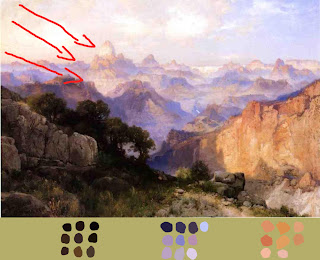
Thomas Moran. The Grand Canyon. 1902.
http://www.paintinghere.com/UploadPic/Thomas%20Moran/big/The%20Grand%20Canyon%201902.jpg
Another example of by Moran, only this time the analogous harmony system is being used. We know this with yellow/orange and purple/blue being opposite on the colour wheel but both colour groups compliment. Cooler colours push back while warm colours come forward, this is due to the fact that our eyes have red cones connected to the brain therefore we are more sensitive to the warms colours in light.
Claude Monet. La Gare Saint-Lazare. 1873-1878.
http://entertainment.howstuffworks.com/arts/artwork/claude-monet-paintings-1873-187814.html
Monet was always interested in light within his paintings. Like this this painting shows a busy trainstation people coming and going so this painting was done very quickly. He quickly captures the main elements of light and smoke but was also interested in the relation of colours. This is an example of complementary harmony. The shadows also reflect the colour of the sky; this is one important feature that level designers stress when creating 3d worlds.
Romantic Movement
Joseph Turner. The Passage of The Saint Gothard. date unknown.
http://www.bestpriceart.com/shop-online/images/vault/turner16.jpg
Turner known as 'the painter of light' using light as his key subject matter. One of the master's he admired was Claude for his quality in Italian landscape painting. This complementary colour scheme of yellow/orange and blue is often used in the Star Wars films especially out in the desert scenes. Again the cool blue is being pushed back while the cliff on the left stands thus drawing our eyes there before looking everywhere else.
Early Renaissance Movement (1400)
Artists before this period never really liked using red and greens as it creates a powerful contrast. But early Renaissance artist made use of these colours to create 'higher levels of beauty' by arranging colours in a different way.
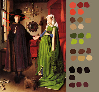
Jan Van Eyck. Portrait of Giovanni Arnolfini and his wife. 1434.
http://emfc.com/blog/wp-content/uploads/2011/01/jan-van-eyck-e28098portrait-of-giovanni-arnolfini-and-his-wife_-1434.jpg
Eyck was an early artist of 'physical accurate' painting. Naturalistic lighting is used in these kind of paintings, not artificial lights. In this painting there is good use of soft shadows at this time artists were learning 'Chiaroscuro' (the treatment of light and dark in paintings). With the contrast of red and green were are instantly drawn to the woman from which we then notice Giovanni and the dog at the bottom. Blue is used very subtly in this painting (the wives sleeves).
Andre Castagno. Last Supper. 1447.
http://upload.wikimedia.org/wikipedia/commons/b/be/Castagno,_Andrea_del_-_Last_Supper_-_1447.jpg
What you notice in Renaissance paintings is the same colours never touch each other and arranged in such a way that at first is overwhelming but pleasing at the same time. Painters at this time were experimented with the colours that were available to them, some colour pigments were expensive because some materials were only available from across the sea. One problem with looking at paintings as early as 1400 or even more is that paintings are often refurbished which means they are not in their original state.
High Renaissance Movement
Leonardo da Vinci. The Last Supper. 1495-1498.
http://johnkemeny.com/blog/wp-content/uploads/2006/06/rom37.jpg
Michael Angelo. Last Judgement. 1537-1541.
http://www.friendsofart.net/static/images/art1/michelangelo-buonarroti-last-judgment-1.jpg
Contemporary
Feng Zhu. Orange City. 2011.
http://fengzhudesign.blogspot.com/2011/07/orange-city.html
Today's concept artist such as Feng Zhu often use the Analagous Harmony colour system. This system is good for landscapes. Like the example above, we are instantly drawn to the city with its warms shades of orange, sky compliments the city by bringing it forward with the contrast of cool colours.
Friday, 25 November 2011
2.0 - Film Study - Naturalistic Lighting - Schindler's List
Schindler's list is a 1993 American film about Oswald Schindler during the Holocaust who helped save thousands of Jews by running a factory. The Film makes really good use of Naturalistic lighting as well as silhouettes.
From the image above we can see natural light being used to Silhouette the character in this scene. There is the lamp on the desk on the left hand side, which helps create more interest and creates a contrast with the figure silhouetted in brightness but with the lamp brightening up in darkness. Contrast is always present in Film Noir style and this is no different.
Again like the image above the use of silhouettes is being used. With the Nazi helmet visible on the left hand side and the soldiers gun we know there is trouble ahead. The back lights help to convey this message again creating contrast.
This scene makes great use of Naturalistic lighting, the fact that there is rim light surround SS Amon Goth (Ralph Fiennes) this establish him as the leader in this group. From the way the shadows are projecting on the curtains we can assume its maybe lunchtime or early afternoon as the sun is most bright at this time.
This is an important shot because from time to time Schindler does what he can to bargain with Goth. This is classic use of 3 point lighting. From the left the light is brightest but also the other side of him he has a soft shadow, this is almost portraying the good and bad side of Goth; as a war leader he is ruthless but sometimes he shows his human side. The light conveys this message and it reads clear to us because of it.
This is the scene from the Jewish woman who finds out that Schindler's factory is classed as a 'Haven' where people are treated right. She impatiently waits for Schindler to meet her. The way the shadows bounce off the wall and the strong specular highlight on the wall maybe suggests hope for the woman? The way the camera is angled to makes the whole scene become more dramatic as this is a matter of life or death for the woman to get a job here.
Above demonstrates a classic technique used in Film Noir where the light is focused on a character's eyes this creates more tension in a scene or a change in the characters personality. A key light highlights the face and there is back light that helps establish where we are. Also some of the back light hits Schindler so we know who she is talking to.
By looking at these various shots in Schindler the way in which lighting techniques have been executed I can apply these to the environments in which I create. By knowing how to use lighting setups properly this will help aid in the navigation of the environments I am setting out to design. For example, back lights could be used to show some of the architecture designs and then maybe use a key light to highlight the door a player needs to enter.
2.0 - Silohuette in Film
There was one scene in Dark Knight that really caught my eye. Near the end when Batman is faced with the tough decision of who to save. There is a really great image that depicts this emotion with silhouette and colour contrast. I thought this would be an interesting area to study.
Screenshot in Film.
Same screenshot but converted to grayscale.
My tonal Sketch of the screenshot.
This is my final Digital Painting of the Screenshot. By doing this from a tonal point of view it's helped me to understand what makes depth in a picture, the bold and much darker shades come forward and the mid tones tend to push back. From my research it's proved especially in this painting that warmer colours come forward and cooler colours push back; concept artist Ryan Church (Star Wars, Transformers) often says this in his training DVD's.
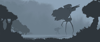
This is a painting that I created using Photoshop based on the values that I learned from painting for the Dark Knight. Before I would paint without any regard to simply values to create depth, now my paintings look more dynamic by studying values in film.
Subscribe to:
Comments (Atom)


