Saturday, 29 October 2011
Development Sketches
This was a simple church study I did based on some of the photographs that I took looking at shape and form; getting a better understanding of how these buildings are layed out.
These are initial ideas that I have been thinking about for my 3d environment the main study here was form rather than colour. Above is the kind of end result that I would like to have just I want to primaryly focus on lighting the building rather than all the other features.
I thought about exploring an interior environment (inside a church) because I think there could be a lot of small interesting features rather than worrying about a massive outdoor environment.
This is another angle of an interior of a church. I remember looking at some impressionist paintings and roses was the main focus and it really caught my eye and I though it was amazing to look at. So I thought about the idea of roses leading to a tree inside a church. Using a small colour palette I was trying to lead the eye to the tree although the silhouette itself stands out.
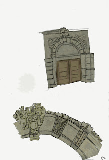
This is from a building next to Post Office at Mc Manus Galleries. I thought the detail in this door was interesting so using the photograph I studied the details in the arch of the door. This was to get myself with common architectural features which are present in many traditional buildings.
Above is an idea I had of creating a maze and guiding the player with a tube of light (inspired by light setup in the Enchanted forest). But after speaking with Brian it was clear I was looking at the aesthetics of an environment more than just light on it's own.
Subscribe to:
Post Comments (Atom)


No comments:
Post a Comment