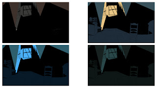
The Sci-fi pallete shows that there is a variety of different colours here following similiar schemes to both horror and RPG.
The wargames genre has shown the most de-saturation both bright and dark. Since this project main concern is horror Deadspace 2 and Left 4 Dead 2 will be looked at in further detail to get a deeper understanding of colours used.
The images below are taken from 2 of the colour groups above Similiar atmosphere are expressed here but again the darker contrast (image below) looks much more dramatic highlighting the jagged edges of the rocks.


No comments:
Post a Comment