Friday, 23 March 2012

Yashar Kassai's technique

The one thing he says is simple is more. He approaches every object from its darkest tone to mid then highlights. I tried this technique for myself and found that images read clear but artwork remains almost like a cartoon.


This is a colour group from system and already we see a decent colour script that could be used for developing further. Blue has been used in tonal increments to create a more realistic render. 


Colour script idea

Using this approach to my paintings the viewers should be able to get a really clear idea of the colours that I have used. Due to the time left in the project there isn't enough time to do something photo-realistic and I don't think it would compliment the project in doing so.


Sketch - Scanned in


Colour Script Idea.
I've considered if a player is going to move through this area how would they get about? Using sharp shadows and contrasts I hope this brings enough interest for the viewer. Using blues and oranges I think this makes the piece really interesting.


Tuesday, 20 March 2012

Brainstorm


Since looking at a lot of examples of snow its made me want to explore rocky landscapes and see if I can start putting together final concept pieces.


I am thinking how the player is going to navigate through the scene and how this will impact on the response of the player.


What always makes a dramatic scene is a direct light shining through a dark area. With this idea in mind I thought of wanting to have something in the cave maybe an alien space ship.


Looking back at German Expressionism I thought about using abstract shape cliffs to dominate the landscape, they were interesting but It didn't feel right to explore further. Using Contrast of curves and angular edges to make interesting composition


Creating jagged cliffs that emulate that of a huge monster, I think this makes the sense become alive. 


In the images above I was thinking about the use of Silhoutte to create a sense of depth but it just wasnt't coming together.


Since doing primarily line drawing I found that good ideas to me just weren't working. So I began sketching in terms of light and dark to get a better idea for developing environments. Once I started this process it was made apparent to me that rather than just rely on colour to evoke fear surely light and dark can do the same?


I was thinking of a cliff side that resembled a monster but it ended up ruining the environment taking the focus off of it. I especially like the image (3 row down 3 row across) We get feeling of a dangerous cave with its dark silohuettes and shadows taking up the cieling. 


Again using light and dark I start to explore trees and how they could appear to look frightening but pleasing at the same time. Considering tilting the view for a more dramatic effect. 


I have this idea in my head that I want to create a scene with some kind of unknown object in it. Using dark shadows I try to blend the unknown into the environment but it seems too obvious that its there. 


Using the direct light again I try to create a sharp shadow that contrast with the light but it doesn't feel unsafe  its the opposite. 

Monday, 19 March 2012

Light and Dark influence


What has been realised is that colour is only one aspect of fear. The main driving force is light and shadow, this was very apparent to me when I viewed the image below.


The sharp edges pierce the sky with strong contrast of shadow, we see the silhouette of a horseman we're not sure if he is good or bad. Cool colours remain in the background while warms colours are at the foreground.

I want my final pieces to have a similar feeling where security isn't absolute.

Sunday, 18 March 2012

Film Studies: Red Planet and Mirrors

The film red planet is being looked at because not only does it place on a distant planet but the crew that reach the planet have a robot called 'Amee' turns against them. The sense of being chased is more apparent towards the second half of the film. 


The crew come across what they think is a supply depot but it turns out to be abandoned. In this image we can see tones of browns and gold sheets (used to protect supplies from exposure to the sun). Orange and reds of the flames inside the building draws our eye in to the building. The strong light source on the left creates soft shadows on the sandy/rock ground. Highlights can be seen on the poles creating sharp contrast with the curvy pipe in the foreground. The darkest shadow at the back creates a sense of space and uncertainty within the scene. 


The blue mist in image above creates atmosphere a sense of unknowing. The foreground rocks establish the rocky setting and the cliffs are highlighted by the light coming for the left. The characters silhouette in the mist making them stand out to the audience. The shadow on the right creates the idea of depth. 


Again we see the blue mist giving the sense of being out in the middle of where. The background shadow is much darker creating an even bigger contrast in light. Algae begins to grow on the planet great a bed of green moss and it appeals to us because it reminds us of grass complimented by the earthy brown rocks on the side. Interesting the cold colours on the character bring him forward since all the other colours are mainly natural colours.
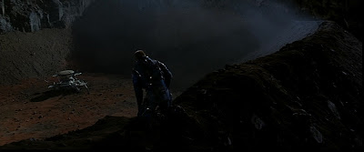
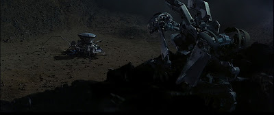


The images above are from the scene in the film when a possible way of contacting life off planet can be made. In the top image the ground is a warmer brown inviting our eyes to look at whats down in the canyon and it compliments how the character feels at the time; sense of relief. In contrast to this Amee shortly afterwards follows him to the shuttle and from the same we can see that ground is much more desaturated since the tone of the scene has changed to that of threatening. The shuttle is much more closer to the camera as the crewman is slouched next to the shuttle with his life in danger.

Below I have created some paintings of my interpretation of the film.


The blue mist creates a mysterious atmosphere adding to the tension with the shadows surrounding the character.


Blu,e green and olive colours are used here again based in a dark setting this scene looks scary.


We see the silhouette of a survivor on the planet and finds a machine that could possibly take him off the environment. Since its at a distance it look alien-like reminiscent of a spider since its a fairy neutral colour so we're uneasy with it because we don't know if will bring hope or danger.

To get a better sense of colour use in the horror genre its appropriate to look at pre-existing films in the same style and analyse how colour is being used; also with light and dark in mind too. Mirrors is a film that uses reflections as a way to create the sense of fear, although it still uses contrasts of light and dark to drive the narrative in it's environments; there is very distinctive colour choice being used as well. 


There first image here looks really unsettling since there is direct lighting hitting the door our eye is instantly drawn to to it. There is contrasts of red and green but also turquoise, this isn't a friendly area at all. The reflection on the floor creates a sense of space but since it's diffused with the light source it appears confusing and creates a sense of panic. We see the silhouette of the guard making his way to the door. 


The warm colour of light shines through the entrance creating both sharp and soft shadows in the area. The light representing safety of the outside world; this area is dirty making it clear that is hasn't been habited for a long time. Since most of the area has fallen into the dark we feel vulnerable since we can't see the entire scene clearly. There is the contrast of blue on the right creating more atmosphere and sense of detachment from the environment.


In the image above we see the security guard (Kieffer Sutherland) patrolling a shut down Mayfair flower department. We can see Turquoise dominating this scene again detaching the viewer from the scene. Pools of small lights creates a diffused shadows on the floor creating an unsettling space. The light from the torch contrasts with the scene drawing our eye to the security guard. Again we see the use of Silhouettes being used.  


This scene again we see colour contrasts of yellow/orange and turquoise with the steam being highlighted in the light create a sense of mystery. Light diffuses through the water creating more uncertainty with huge shadows on the background wall. 


The image above uses tones of blue with 1 light source creating strong contrasts in the scene. Since there is so much darkness it is hard to read what is going on in this area this creates the sense of abandonment.


This is a scene back at the house with the family where the boy has had a nightmare and yellows for his mother. The warm colours on the left draw our eye to here and we can see this is his mum yet on the right where the boy lies surrounded with greys with a huge shadow approaching his bed creating a sense of panic because at this moment we're unsure if this is a monster from his nightmare or his mothers. 

So we can see that contrast of colour is used to help drive the story between good and bad in each scene. Also it creates the feeling of emptiness and detachment from the environments. This is a feature I want to express in my paintings. 


Saturday, 17 March 2012

Film: Pitch Black

Since most of the film is based in the dark how does colour work? Since this is based on an alien world naturally humans will not be felt welcome and this will show within the set taking place.


Cold dark blues of light pours in key areas in the cave that actually bring them forward since the blues in the background are de-saturated which creates a sense of depth. The rocks create sharp shadows and we instantly feel unsafe. Dust clouds the light sources heightening the atmosphere in the scene. 


The image above is primarily greys and blues, cast shadows diffuse on the rocks creating grainy textures we can see reflected light at the bottom of the cave again creating depth. There is a huge space between the ground in save and the light hitting the top of the rock. At this point in the film a character is being cut free from a rope leading into the cave that a monster quickly swoops past to try and attack. Space can be a great  form of creating fear.


The planet goes through a long night cycle. This show is when the creatures are making their way out the caves to begin their hunting of the survivors of the ship crash. There is mainly browns and oranges and since we see the sharp rock ridges we know something is going to happen. The rocks are angled toward leaning towards the lighter oranges  on the left so we get the sense of where the sun is coming from.


This show here the survivors are making their way to a ship for safety. This is is really dramatic, we see the warm sun on the right with almost half the scene in total darkness. From this shot there is this feeling of very little life. Again there is use of browns and oranges, ironically the colours are warm we don't feel familiar with the terrain. The silohutte of the character on the right indicates to use that safety is in this direction.


Our eyes are instantly drawn to the turquoise fluorescent lights that guide the survivors through the rockery plains of the planet. Bounce light reveals edges of the creatures that surround them this helps create the frame for this shot but we know there is activity going in the shadow. This creates tension because the creatures are unpredictable and could attack at any time. 


The image above is the point where the survivors are losing light in a canyon. Mostly browns are used in this scene with highlights of rain create a screen waiting it scarier than the shadows but nothing can be seen at all. Center light hits off the rocks creating rough textures making this area unwelcome.


Experimentation with images from film looking at colour temperature (Kelvin Degree System). 


Obscure shapes create a sense of fear


large shadows creat an unsettling atmosphere even though its warm colours beings used


Silhouette of rocks contrast with sky making them looking threatening.


Friday, 16 March 2012

Film Studies: The Thing & Pitch Black

The Thing has been chosen to be looked at as it set in the Arctic and it will be interesting to see how it's applied to such a setting. Since all the other films have mainly been rocky scenes and indoor spaces looking at colour in a snowy setting will give a broader insight into the use of colour into this media. 


The images above depict a part of the station (where the scientists are situated) to be abandoned. Both use a monochromatic scheme with shades of browns that contrast with the white snow. The characters remain silhouetted with the background making them stand out more and also show their lack of connection to the scene.  


The dominant colour in this blue but its so dark it makes the room look like it represents night time. The characters profile projects on the wall with the lighters raise contrast with the scene. Light reflects of the scientist face making the overall tone of the scene worry because he seems unsure himself what he expects to see.


The is strong use of complimentary colours of blue with tones of pink and purple lighting the way for the scientist in this picture. Yet it remains unsafe with the shadows on the left contrasting with cold blues.

Below are my sketches from 'The Thing' I was exploring how the film uses light and shadow. Below is the starting sequence where something goes wrong at the station.

by painting the shot it gave me ideas of the colours being used which I then used to create the same scene in my own way I try express a sense of fear. Making use of an ambient shadow to create space and using the silhouette again makes this sense unsettling. 


From doing the image above it gave me an idea of colour temperature with pink, light purple and dark purple with the blue fluorescent light and huge shadow in the back creates fear in this painting.


We see complimentary colours here such as yellow and blue being played together with the use of intense light and dark makes this sense really dramatic. 


Since most of the film is based in the dark how does colour work? Since this is based on an alien world naturally humans will not be felt welcome and this will show within the set taking place.


Cold dark blues of light pours in key areas in the cave that actually bring them forward since the blues in the background are de-saturated which creates a sense of depth. The rocks create sharp shadows and we instantly feel unsafe. Dust clouds the light sources heightening the atmosphere in the scene. 


The image above is primarily greys and blues, cast shadows diffuse on the rocks creating grainy textures we can see reflected light at the bottom of the cave again creating depth. There is a huge space between the ground in save and the light hitting the top of the rock. At this point in the film a character is being cut free from a rope leading into the cave that a monster quickly swoops past to try and attack. Space can be a great  form of creating fear.


The planet goes through a long night cycle. This show is when the creatures are making their way out the caves to begin their hunting of the survivors of the ship crash. There is mainly browns and oranges and since we see the sharp rock ridges we know something is going to happen. The rocks are angled toward leaning towards the lighter oranges  on the left so we get the sense of where the sun is coming from.


This show here the survivors are making their way to a ship for safety. This is is really dramatic, we see the warm sun on the right with almost half the scene in total darkness. From this shot there is this feeling of very little life. Again there is use of browns and oranges, ironically the colours are warm we don't feel familiar with the terrain. The silohutte of the character on the right indicates to use that safety is in this direction.


Our eyes are instantly drawn to the turquoise fluorescent lights that guide the survivors through the rockery plains of the planet. Bounce light reveals edges of the creatures that surround them this helps create the frame for this shot but we know there is activity going in the shadow. This creates tension because the creatures are unpredictable and could attack at any time. 


The image above is the point where the survivors are losing light in a canyon. Mostly browns are used in this scene with highlights of rain create a screen waiting it scarier than the shadows but nothing can be seen at all. Center light hits off the rocks creating rough textures making this area unwelcome.