Wednesday 28 December 2011

3.0 - Building the Environment


Above is the basic sketch how I want the level to be constructed. Quite simply the player will have just entered the doors of the church and the main focus point will be a stain glass window at the back. The player will then have to navigate through a maze-like level. From my research in Colour Harmony's these will be experimented with using those colours but for the lights that will be placed through-out the level. 

Using traditional methods (colour harmony's) and lighting techniques (Film Noire) will player's be able to make through the level quicker based on the setups that I have done? There will probably 3 iterations of the level so It's important that the levels can be re-built in different ways quickly and efficiently.

Below I have constructed a church structure in a Modular fashion this means that when I bring each object in UDK they will snap to the grid nicely and also can be re-arranged quickly. Luckily the way in which this have been constructed there is roughly 15-20 meshes that make up this entire structure. With the added furniture like benches cabinets and probably more architectural detail maybe make that between 35-40 meshes. 

I will be using UV Master (Zbrush plugin) to quickly UV map meshes and then finally texturing them. This will take quite a bit of time but I aim to get the main object UV'd and textured. The colour of lights is what shall give the level(s) it's final touch.

I don't even think the front end will be added It's too time consuming to add all of it but at least its there if it needs to be used. The small cube in each picture is the exact size of a player in UDK so there is a lot of room for the player to run about.
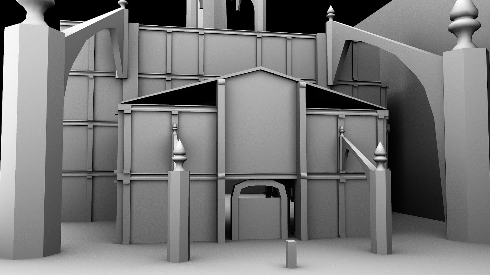
Front Entrance.

Main Interior.

Wednesday 21 December 2011

3.0 - Environment Development

Below are Blue pencil animation Sketches that I have done looking at Exterior/Interior Architecture. Mainly looking at shape, form and composition. From doing these drawings I've gained a better understanding of what makes Gothic architecture so distinctive with it's use of curved arches and sharp edges.  These features will help shape my own environment.


I'm not sure why the building looks so angled (probably the way I was sitting) But it's still a study none of the less :-D


I even began looking at various trees but this is beyond the scope of the project.


 Above is an idea I had for the entrance of the level. Although the fact that there will be 2-3 different levels for testing I be focusing on in the interior as these can be built much quicker especially with BSP brushes in UDK.

 Above: Further idea for the look of the church outside.


Friday 16 December 2011

3.0 - Tonal Sketches

Like a painting, if the values aren't established early on then applying colour will only make reading paintings, drawings or anything else difficult to read properly. Using Tonal Pen Markers I studied some various photographs and kept in mind where the light source is coming from. Once the grey pen tones were put down I then used a fine tip pen to put in the final shape.


The drawing above was a scene I made up from imagination, this was just experimenting with the different grey tone pens since I've never used them before. However,only using them for a short period of time I've found my sketches read much better and I can really control values with the pens. Each sketch takes a maximum of 20 minutes (this is due to the fact that the pen dries in quickly).


Thursday 15 December 2011

2.0/4.0 - Game Studies: Mirror's Edge

The reason I chose to study this game is because this is a fast paced first-person free running game that requires quick navigation of environments in order to progress. The colour structure in this game is very simple but its enough to guide the player through its various obstacles.


For the most part the environments are mainly white but our eyes are quickly drawing to the intense hues. It's the colour that guides our eyes Simple blues, red and yellows paint the path ahead and either its a colour harmony or contrast that its used to indicate an entrance to the next point. For example at the bottom left we are drawn to the door (the complimentary of the red and green). Early on in the game you are notified that red objects are where your main goals are when navigating through the environments.


Above are more examples, even with the top left we make sense of the pink environments because of the different values of light. The red rope guides our eye to the next point therefore we know instinctively to jump. The bottom left uses colour contrasts with the red and blue to make our way across the pipe and continue on. 

By looking at these examples it's helped my understanding in practical situations in game environments when certain colours maybe used. Although there is no guidelines anywhere that indicate which in fact are the best colour combinations to use, all we can do is use your best judgement to colour our environments.

Wednesday 14 December 2011

2.0/4.0 - Game Studies: Alice Madness Returns

The Main purpose in studying this game is to identify use of colour in some of various environments which can then be applied to my own. By completing this game it has really helped me to structure colour in terms of what works and looks really appealing but also help in the navigation of the surreal worlds that you travel throughout the game.


Above is screenshots taken from the 'Doll House' chapter. This level has the biggest variation of colours apart from 'Wonderland'. This level makes use of split-complimentary colours, for example, at the top we see a combination of green, red and oranges and yellow. That's 4 different colours but they work together, so in the way we put colours together we should never limit our palette although the fewer the more clearer features will read.

 Even with the 'Fort Resistance'. With so many colours, like the Renaissance paintings, there is no same colours next to eachother, again another example of Split-Complimentary, also some Tertiary harmony's are going with the greens and blues of this design.  


The final boss in the game makes use of colour contrast with the green and red. Only at a glance we can quickly establish that Alice is on some kind of platform and that is probably best she avoids falling off! Simple can often mean more in visuals. Environments should read this clearly, even though this is very stylized everything reads clearly.


This during the underwater levels and quite often use the colour contrasts of yellows and greens, also tetiary harmony's (same colour but with different tones). 


Similiar to the doll house when we enter Wonderland we are blown away with the visuals, the colours appear really vibrant and no colour looks out of place. With the earthly colours of yellows, browns and greens are complimented with the reds and blues; even at the bottom left with the complimentary harmony of the yellow and purple

Sunday 11 December 2011

Other Activities

For 4 weeks now I have been taken up jogging for 20 mins Monday to Friday. As a result from doing this not only do I start the day much earlier but I give myself much more time to get on with studies. I think my overall work as improved and the volume as well.

Also every fortnight or so I head down to S2K (recording studio) for a 2 hour Drum session for stress release. This is really important to me because it helps me clear my head and begin the week with a fresh head.

Thursday 8 December 2011

3.0 - UDK Testing - My Church

As the final artifacts deal with the navigation of an environment it is important to be able to create levels with accuracy and speed. The main environment will consist of a dominating architectural building (Gothic Cathedral) in an outdoor wilderness surrounded by rocks, foliage etc.

I want the entrance to have strong architectural designs that will then lead the player into the building (from which the navigation will start taking place). I have looked at directional lighting (rays from sun) and shadows, post-processing and ambient Occlusion (created in UDK). I'm still unsure if I should create a small outdoor environment or focus just indoor's as the main purpose is primarily navigation.

This was a test of creation, most of the ground and indoor rooms were made purely in BSP brushes with no need for Maya. I think Maya will be used only for creating smaller objects and some of the entrance to the buildings. The foliage was content from UDK (which I will probably use in the final artifact), also the rocks were from UDK but I can create them simply in Maya. I also lowered the saturation of the levels to see if there is clear arrangement in the map.


Far shot of the level. 2 entrances to the building; I want give players choice in what way to enter but this will be further defined through sketchbook work.


Entrance of building.


Combination of red and green; colour contrasts often seen in paintings during the Renaissance Art Movement.

Wednesday 7 December 2011

Getting Submission Ready

This week is all about getting material ready for AG1046A. Also I really want to get the lit review section done for AG1087A as it's vital I get feedback on my research.

After speaking with a number of lecturers including my supervisor, this week has primarily focused on making sure all my research has been looked into and I have appropriate notes into my area of interest light and colour. Gant Chart, Learning Contract and Project Map have all been completed. The Personal Statement is finished but this will be double checked tomorrow with Brian.

Wednesday 30 November 2011

Exposition Research Mc Manus Galleries

I have been to Mc Manus a number of times but never to look at how the items are actually being displayed. I took a lot of pictures and got some really good ideas for how I want to setup my place for the exposition. I have set up these kinda of workplaces before in college so I have a good idea how my work should be displayed in the best possible way.