The reason I chose Star Wars for the colour studies was because in a universe that doesn't actually exist we can still make sense of what different features represent. Especially during fast scenes certain shots are less than a second on the screen. But in that split second we can still understand where the action is going.
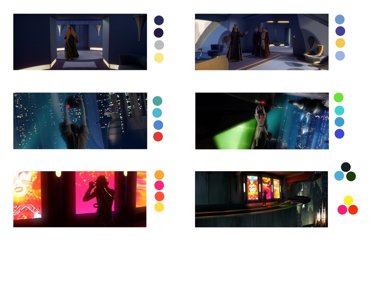
Although the rule of thumb is warm colours bring things forward. During Star Wars certain scenes didn't always use this way of colour structure.
From the scenes above you can see infact a lot of the shots are dominated by cold colours although just the hint of warm colours they appear much clearer because of that colour contrast.
Often the same colour is used but just in different tones it keeps the scenes interesting. Even with the Obi-wan Kenobi when hes hanging onto the droid most of the environment scene is cool colours while just a red dot projecting from the droid we know instantly where the action is.
The shots of the assassin at the bottom intense hues are being used but the colours go well together and the final shot thats out more introduces cooler colours.So we can say that every scene there is either a colour harmony or contrast present to make sense of what we see.

Interesting in the example at the top left makes use of colour temperature, there is 3 paths of light but the one pointing north is much more orange than the others suggesting that the chase is going in that direction. The second shot, again, colour contrast of red's and oranges against the blues and jade's.
Silhouettes are even being used in the next 2 shots, the back of the ship (left image) is the only thing that is pure red and therefore makes it stand out from the image. The city canyon on the right with the brightest part being in the middle; this guides our eyes to the center so we can follow the ships as the purse continues.
The last 2 images are dominated mostly by warms colours but again the contrast of cool colours keeps our eyes focused on the center of the action.
I will need to make use of colour contrast especially in my environments so that the player's can distinguish different features within the levels. Although it will be interesting to see when different groups of contrasting colours are put to the test to see how this affects the time in which players take to navigate through the environment.
No comments:
Post a Comment